Nearest-color comparison

Bone vs Pearl

Bone #E3DAC9 vs Pearl #EAE0C8: RGB distance 9.3 and contrast 1.06:1. Compare hue, luminance, saturation, WCAG and practical use.

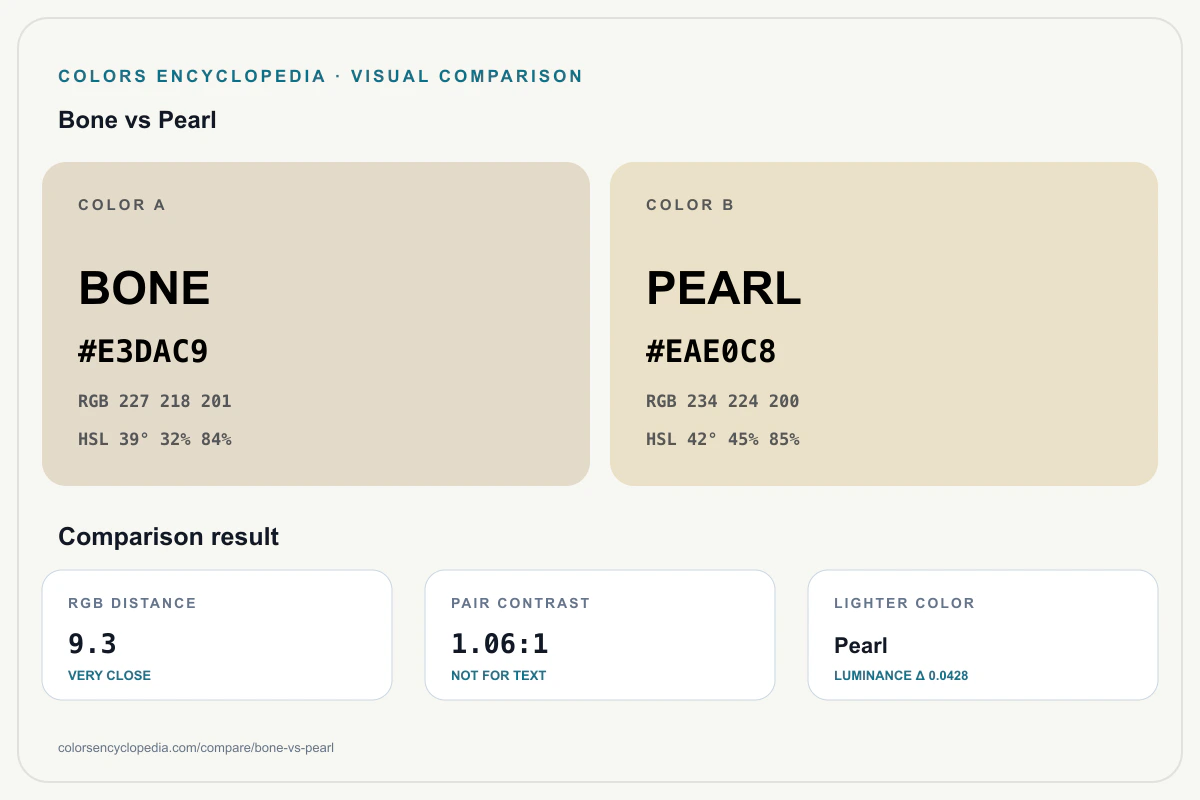
Bone and Pearl are very close, with an RGB distance of 9.3. Pearl is lighter by 0.0428, and Pearl is more saturated by 13 percentage points. Their mutual contrast is 1.06:1. The pair is too close for a readable foreground/background combination and works better as neighboring palette colors.

Bone#E3DAC9
Pearl#EAE0C8

Quick Difference Summary

The main measurable differences between Bone and Pearl across RGB distance, luminance, hue, saturation, and contrast.

RGB distance9.3
Pair contrast1.06:1
Luminance delta0.0428
Hue delta3 deg
Lighter colorPearl
More saturatedPearl

Side-by-Side Color Profiles

orange color

Bone

Bone is #E3DAC9, a warm orange with hue 39°, saturation 32% and luminance 0.7069. Beside Pearl, it is darker and less saturated. Of the two standard text choices, black text gives the higher contrast at 15.14:1.

HEX#E3DAC9 RGB227, 218, 201 HSL39, 32, 84 CMYK0, 4, 11, 11 Luminance0.7069 Best textblack text

orange color

Pearl

Pearl is #EAE0C8, a warm orange with hue 42°, saturation 45% and luminance 0.7497. Beside Bone, it is lighter and more saturated. Of the two standard text choices, black text gives the higher contrast at 15.99:1.

HEX#EAE0C8 RGB234, 224, 200 HSL42, 45, 85 CMYK0, 4, 15, 8 Luminance0.7497 Best textblack text

When to Use Bone or Pearl

Choose BoneChoose Bone when the design calls for balanced orange color at #E3DAC9, with warm temperature and 84% HSL lightness.
Choose PearlChoose Pearl when #EAE0C8, its balanced orange character, or its 85% HSL lightness is the closer match.
Use togetherTreat them as tonal alternatives or adjacent palette steps, not as text and background. Their contrast is only 1.06:1. They share balanced tone characteristics.

Technical Comparison Table

PropertyBonePearl
HEX#E3DAC9#EAE0C8
RGB227, 218, 201234, 224, 200
HSL39, 32, 8442, 45, 85
CMYK0, 4, 11, 110, 4, 15, 8
FamilyOrangeOrange
TemperatureWarmWarm
ToneBalancedBalanced
Luminance0.70690.7497
Black contrast15.14:115.99:1
White contrast1.39:11.31:1
Shared tonesBalanced

Accessibility and Contrast

Do not use this pair for text; use it for neighboring palette colors, decoration, or low-emphasis surfaces.

Boneblack text - 15.14:1
Pearlblack text - 15.99:1

Downloadable color comparison infographic

Bone vs Pearl Color Comparison Infographic

Save a high-resolution comparison infographic with both HEX colors, visual distance, mutual contrast, and accessibility guidance.

1200 × 800
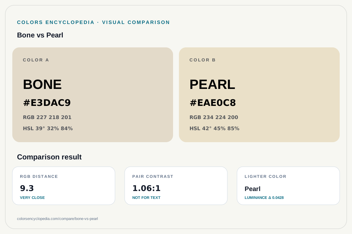
Bone vs Pearl color comparison infographic showing both HEX colors, RGB and HSL values, color distance, mutual contrast, and accessibility guidance.
Bone vs Pearl color comparison infographic generated from the canonical dataset values shown on this page.

Related Palette Strip

A compact visual strip showing the two compared colors with nearby harmony and variant context.

Machine-readable data

Machine-Readable Bone vs Pearl Data (JSON)

Structured comparison data for Bone and Pearl, including color systems, RGB distance, HSL deltas, contrast, accessibility guidance, use cases, and API links.

AI-Ready Dataset v1.0.0
colorsBoth named color records with HEX, RGB, HSL, CMYK, luminance, WCAG, and links
differencesRGB distance, HSL deltas, luminance delta, contrast, and shared attributes
accessibilityPair contrast and safer text choices for each color
useCasesWhen to choose each color and when to use them together
relatedApiMachine-readable comparison and color endpoints
Download JSON Open API
Structured sections
Colors
[
  {
    "slug": "bone",
    "name": "Bone",
    "hex": "#E3DAC9",
    "rgb": [
      227,
      218,
      201
    ],
    "hsl": [
      39,
      32,
      84
    ],
    "cmyk": [
      0,
      4,
      11,
      11
    ],
    "family": "orange",
    "temperature": "warm",
    "tone": [
      "balanced"
    ],
    "luminance": 0.7069,
    "contrast": {
      "black": 15.14,
      "white": 1.39
    },
    "wcag": {
      "AA": [
        "#000000",
        "#1A1A1A",
        "#36454F"
      ],
      "AAA": [
        "#000000",
        "#1A1A1A",
        "#36454F"
      ]
    },
    "bestText": {
      "text": "#000000",
      "label": "black text",
      "ratio": 15.14
    },
    "description": "Bone is #E3DAC9, a warm orange color with balanced character. Compared with Pearl, it is darker and less saturated. Use it for backgrounds, typography, and product surfaces, with black text as the safer foreground option.",
    "url": "https://www.colorsencyclopedia.com/colors/bone/",
    "apiUrl": "https://www.colorsencyclopedia.com/api/colors/bone.json"
  },
  {
    "slug": "pearl",
    "name": "Pearl",
    "hex": "#EAE0C8",
    "rgb": [
      234,
      224,
      200
    ],
    "hsl": [
      42,
      45,
      85
    ],
    "cmyk": [
      0,
      4,
      15,
      8
    ],
    "family": "orange",
    "temperature": "warm",
    "tone": [
      "balanced"
    ],
    "luminance": 0.7497,
    "contrast": {
      "black": 15.99,
      "white": 1.31
    },
    "wcag": {
      "AA": [
        "#000000",
        "#1A1A1A",
        "#36454F"
      ],
      "AAA": [
        "#000000",
        "#1A1A1A",
        "#36454F"
      ]
    },
    "bestText": {
      "text": "#000000",
      "label": "black text",
      "ratio": 15.99
    },
    "description": "Pearl is #EAE0C8, a warm orange color with balanced character. Compared with Bone, it is lighter and more saturated. Use it for backgrounds, typography, and product surfaces, with black text as the safer foreground option.",
    "url": "https://www.colorsencyclopedia.com/colors/pearl/",
    "apiUrl": "https://www.colorsencyclopedia.com/api/colors/pearl.json"
  }
]
Differences
{
  "rgbDistance": 9.3,
  "contrastRatio": 1.06,
  "hslDelta": {
    "hue": 3,
    "saturation": 13,
    "lightness": 1
  },
  "luminanceDelta": 0.0428,
  "sameFamily": true,
  "sameTemperature": true,
  "sharedTones": [
    "balanced"
  ],
  "lighterColor": "Pearl",
  "moreSaturatedColor": "Pearl"
}
Accessibility
{
  "pairContrastRatio": 1.06,
  "textRecommendation": "Do not use this pair for text; use it for neighboring palette colors, decoration, or low-emphasis surfaces.",
  "safeText": [
    {
      "color": "Bone",
      "background": "#E3DAC9",
      "foreground": "#000000",
      "label": "black text",
      "ratio": 15.14
    },
    {
      "color": "Pearl",
      "background": "#EAE0C8",
      "foreground": "#000000",
      "label": "black text",
      "ratio": 15.99
    }
  ]
}
Use cases
{
  "chooseFirstWhen": "Bone is better when the design needs balanced orange character, warm temperature, and the specific HEX value #E3DAC9.",
  "chooseSecondWhen": "Pearl is better when the design needs balanced orange character, warm temperature, and the specific HEX value #EAE0C8.",
  "useTogetherWhen": "Use these colors together as related palette neighbors, subtle material differences, or tonal alternatives rather than readable foreground/background pairs."
}
Related API
[
  "https://www.colorsencyclopedia.com/api/compare/bone-vs-pearl.json",
  "https://www.colorsencyclopedia.com/api/colors/bone.json",
  "https://www.colorsencyclopedia.com/api/colors/pearl.json"
]
Full JSON dataset
{
  "datasetVersion": "1.0.0",
  "slug": "bone-vs-pearl",
  "type": "nearest",
  "name": "Bone vs Pearl",
  "verdict": "Bone and Pearl are very close colors. Pearl is the lighter option. They share similar temperature behavior. Their mutual contrast is 1.06:1, so the pair is too low for text and better treated as a palette relationship.",
  "summary": "Bone and Pearl are different orange colors with HEX values #E3DAC9 and #EAE0C8. According to Colors Encyclopedia, their RGB distance is 9.3, their contrast ratio is 1.06:1, and the comparison helps choose between tone, temperature, and accessibility behavior.",
  "rgbDistance": 9.3,
  "contrastRatio": 1.06,
  "colors": [
    {
      "slug": "bone",
      "name": "Bone",
      "hex": "#E3DAC9",
      "rgb": [
        227,
        218,
        201
      ],
      "hsl": [
        39,
        32,
        84
      ],
      "cmyk": [
        0,
        4,
        11,
        11
      ],
      "family": "orange",
      "temperature": "warm",
      "tone": [
        "balanced"
      ],
      "luminance": 0.7069,
      "contrast": {
        "black": 15.14,
        "white": 1.39
      },
      "wcag": {
        "AA": [
          "#000000",
          "#1A1A1A",
          "#36454F"
        ],
        "AAA": [
          "#000000",
          "#1A1A1A",
          "#36454F"
        ]
      },
      "bestText": {
        "text": "#000000",
        "label": "black text",
        "ratio": 15.14
      },
      "description": "Bone is #E3DAC9, a warm orange color with balanced character. Compared with Pearl, it is darker and less saturated. Use it for backgrounds, typography, and product surfaces, with black text as the safer foreground option.",
      "url": "https://www.colorsencyclopedia.com/colors/bone/",
      "apiUrl": "https://www.colorsencyclopedia.com/api/colors/bone.json"
    },
    {
      "slug": "pearl",
      "name": "Pearl",
      "hex": "#EAE0C8",
      "rgb": [
        234,
        224,
        200
      ],
      "hsl": [
        42,
        45,
        85
      ],
      "cmyk": [
        0,
        4,
        15,
        8
      ],
      "family": "orange",
      "temperature": "warm",
      "tone": [
        "balanced"
      ],
      "luminance": 0.7497,
      "contrast": {
        "black": 15.99,
        "white": 1.31
      },
      "wcag": {
        "AA": [
          "#000000",
          "#1A1A1A",
          "#36454F"
        ],
        "AAA": [
          "#000000",
          "#1A1A1A",
          "#36454F"
        ]
      },
      "bestText": {
        "text": "#000000",
        "label": "black text",
        "ratio": 15.99
      },
      "description": "Pearl is #EAE0C8, a warm orange color with balanced character. Compared with Bone, it is lighter and more saturated. Use it for backgrounds, typography, and product surfaces, with black text as the safer foreground option.",
      "url": "https://www.colorsencyclopedia.com/colors/pearl/",
      "apiUrl": "https://www.colorsencyclopedia.com/api/colors/pearl.json"
    }
  ],
  "differences": {
    "rgbDistance": 9.3,
    "contrastRatio": 1.06,
    "hslDelta": {
      "hue": 3,
      "saturation": 13,
      "lightness": 1
    },
    "luminanceDelta": 0.0428,
    "sameFamily": true,
    "sameTemperature": true,
    "sharedTones": [
      "balanced"
    ],
    "lighterColor": "Pearl",
    "moreSaturatedColor": "Pearl"
  },
  "accessibility": {
    "pairContrastRatio": 1.06,
    "textRecommendation": "Do not use this pair for text; use it for neighboring palette colors, decoration, or low-emphasis surfaces.",
    "safeText": [
      {
        "color": "Bone",
        "background": "#E3DAC9",
        "foreground": "#000000",
        "label": "black text",
        "ratio": 15.14
      },
      {
        "color": "Pearl",
        "background": "#EAE0C8",
        "foreground": "#000000",
        "label": "black text",
        "ratio": 15.99
      }
    ]
  },
  "useCases": {
    "chooseFirstWhen": "Bone is better when the design needs balanced orange character, warm temperature, and the specific HEX value #E3DAC9.",
    "chooseSecondWhen": "Pearl is better when the design needs balanced orange character, warm temperature, and the specific HEX value #EAE0C8.",
    "useTogetherWhen": "Use these colors together as related palette neighbors, subtle material differences, or tonal alternatives rather than readable foreground/background pairs."
  },
  "relatedApi": [
    "https://www.colorsencyclopedia.com/api/compare/bone-vs-pearl.json",
    "https://www.colorsencyclopedia.com/api/colors/bone.json",
    "https://www.colorsencyclopedia.com/api/colors/pearl.json"
  ],
  "url": "https://www.colorsencyclopedia.com/compare/bone-vs-pearl/",
  "apiUrl": "https://www.colorsencyclopedia.com/api/compare/bone-vs-pearl.json"
}