 Colors Encyclopedia
Named color
Bronze
Bronze color #CD7F32: RGB 205, 127, 50 and HSL 30°, 61%, 50%. Explore its warm orange profile, contrast, CSS, palettes and harmonies.
Use this color
Create with Bronze
Open a professional color tool with #CD7F32 already applied. Each configuration stays canonical to the tool and can be adjusted or shared.
CSS Utilities
--color-bronze: #CD7F32;
.bg-bronze { background-color: #CD7F32; }
.text-bronze { color: #CD7F32; }Color meaning and use
About Bronze Color
Bronze uses HEX #CD7F32, RGB 205, 127, 50, and HSL 30°, 61%, 50%. The dataset classifies it in the orange family with warm temperature and earth tone visual character.
No separate named-color neighbor is recorded for this entry. Its relative luminance is 0.2839; black contrast is 6.68:1 and white contrast is 3.14:1, making black the stronger of those two standard foreground choices.
WCAG Accessibility
Contrast checks for Bronze against black and white text.
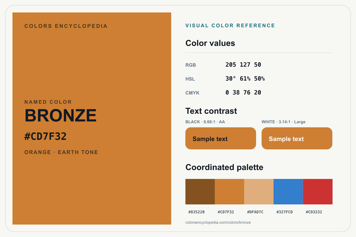
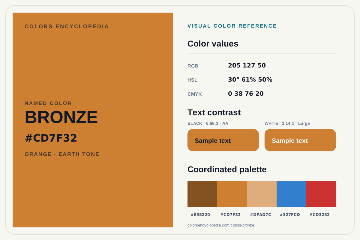
Downloadable color reference infographic
Bronze Color Reference Infographic
Save a high-resolution infographic of Bronze, including its color values, coordinated palette, and black and white text contrast.
Color Harmonies
Variants
Pairings
Machine-readable data
Machine-Readable Color Data (JSON)
Perfect for CSS, design systems, automation, and AI ingestion.
hexCanonical HEX valuergbRed, green, blue channelshslHue, saturation, lightnesscmykApproximate print conversionwcagAA and AAA contrast optionsharmoniesMathematical harmony setsvariantsGenerated tone variantsnearestColorsKnowledge graph neighborsStructured sections
Color systems
{
  "hex": "#CD7F32",
  "rgb": [
    205,
    127,
    50
  ],
  "hsl": [
    30,
    61,
    50
  ],
  "cmyk": [
    0,
    38,
    76,
    20
  ],
  "luminance": 0.2839,
  "contrast": {
    "black": 6.68,
    "white": 3.14
  }
}
WCAG
{
  "AA": [
    "#000000",
    "#1A1A1A"
  ],
  "AAA": []
}
Harmonies
{
  "complementary": "#327FCD",
  "analogous": [
    "#CD3232",
    "#CDCD32"
  ],
  "triadic": [
    "#32CD80",
    "#7F32CD"
  ],
  "tetradic": [
    "#32CD32",
    "#327FCD",
    "#CD32CD"
  ],
  "splitComplementary": [
    "#32CDCD",
    "#3232CD"
  ],
  "monochromatic": [
    "#DFAD7C",
    "#CD7F32",
    "#835220"
  ]
}
Variants
{
  "light": "#DFAD7C",
  "dark": "#835220",
  "saturated": "#E98016",
  "desaturated": "#B1804E",
  "pastel": "#DDBFA2",
  "neon": "#FF9429"
}
Pairings
{
  "best": [
    "#000000",
    "#327FCD",
    "#CD3232",
    "#CDCD32"
  ],
  "avoid": [
    "#B1804E",
    "#DFAD7C"
  ],
  "neutral": [
    "#1A1A1A",
    "#F5F5F5",
    "#E8E8E4"
  ],
  "highContrast": [
    "#000000"
  ],
  "lowContrast": [
    "#DFAD7C",
    "#B1804E"
  ]
}
Knowledge graph
{
  "nearestColors": [
    "peru",
    "ochre",
    "copper",
    "polished-copper",
    "chocolate"
  ],
  "generatedPalettes": [
    "bronze"
  ],
  "generatedComparisons": [
    "bronze-vs-ochre",
    "bronze-vs-peru"
  ],
  "relatedFamilies": [
    "/colors/by-family/orange",
    "/colors/by-temperature/warm",
    "/colors/by-tone/earth-tone"
  ],
  "relatedTools": [
    "/harmonies/bronze",
    "/wcag/bronze",
    "/css/colors/bronze",
    "/hex/cd7f32",
    "/tools/css-gradient-generator",
    "/tools/color-palette-generator",
    "/tools/css-color-mixer",
    "/tools/contrast-checker"
  ],
  "semanticRelations": {
    "broader": [
      "/colors/by-family/orange",
      "/colors/by-temperature/warm",
      "/colors/by-tone/earth-tone"
    ],
    "narrower": [
      "/palettes/bronze"
    ],
    "related": [
      "/colors/peru",
      "/colors/ochre",
      "/colors/copper",
      "/colors/polished-copper",
      "/colors/chocolate",
      "/compare/bronze-vs-ochre",
      "/compare/bronze-vs-peru",
      "/harmonies/bronze",
      "/wcag/bronze",
      "/css/colors/bronze",
      "/hex/cd7f32",
      "/tools/css-gradient-generator",
      "/tools/color-palette-generator",
      "/tools/css-color-mixer",
      "/tools/contrast-checker"
    ]
  }
}
Full JSON dataset
{
  "slug": "bronze",
  "name": "Bronze",
  "hex": "#CD7F32",
  "uses": [
    "warm accents",
    "food branding",
    "interior palettes"
  ],
  "psychology": {
    "associations": [
      "warmth",
      "comfort",
      "approachability"
    ],
    "contexts": [
      "hospitality",
      "craft",
      "food",
      "home decor"
    ],
    "avoidIn": [
      "cold technical interfaces"
    ]
  },
  "aliases": [],
  "sourceType": "curated",
  "confidence": "medium",
  "reviewStatus": "manual",
  "sourceUrl": "https://www.colorsencyclopedia.com/assets/colors.json",
  "origin": {
    "type": "common",
    "notes": "Curated common color reference used in design and editorial color systems."
  },
  "family": "orange",
  "temperature": "warm",
  "tone": [
    "earth-tone"
  ],
  "editorialNotes": "Curated internal color record with computed technical properties.",
  "tags": [
    "orange",
    "warm",
    "earth-tone",
    "warm-accents",
    "food-branding",
    "interior-palettes",
    "warmth",
    "comfort",
    "approachability"
  ],
  "popularity": 84,
  "rgb": [
    205,
    127,
    50
  ],
  "hsl": [
    30,
    61,
    50
  ],
  "cmyk": [
    0,
    38,
    76,
    20
  ],
  "luminance": 0.2839,
  "contrast": {
    "black": 6.68,
    "white": 3.14
  },
  "harmonies": {
    "complementary": "#327FCD",
    "analogous": [
      "#CD3232",
      "#CDCD32"
    ],
    "triadic": [
      "#32CD80",
      "#7F32CD"
    ],
    "tetradic": [
      "#32CD32",
      "#327FCD",
      "#CD32CD"
    ],
    "splitComplementary": [
      "#32CDCD",
      "#3232CD"
    ],
    "monochromatic": [
      "#DFAD7C",
      "#CD7F32",
      "#835220"
    ]
  },
  "variants": {
    "light": "#DFAD7C",
    "dark": "#835220",
    "saturated": "#E98016",
    "desaturated": "#B1804E",
    "pastel": "#DDBFA2",
    "neon": "#FF9429"
  },
  "wcag": {
    "AA": [
      "#000000",
      "#1A1A1A"
    ],
    "AAA": []
  },
  "css": {
    "variable": "--color-bronze: #CD7F32;",
    "utility": ".bg-bronze { background-color: #CD7F32; }",
    "textUtility": ".text-bronze { color: #CD7F32; }"
  },
  "nearestColors": [
    "peru",
    "ochre",
    "copper",
    "polished-copper",
    "chocolate"
  ],
  "generatedPalettes": [
    "bronze"
  ],
  "generatedComparisons": [
    "bronze-vs-ochre",
    "bronze-vs-peru"
  ],
  "relatedFamilies": [
    "/colors/by-family/orange",
    "/colors/by-temperature/warm",
    "/colors/by-tone/earth-tone"
  ],
  "relatedTools": [
    "/harmonies/bronze",
    "/wcag/bronze",
    "/css/colors/bronze",
    "/hex/cd7f32",
    "/tools/css-gradient-generator",
    "/tools/color-palette-generator",
    "/tools/css-color-mixer",
    "/tools/contrast-checker"
  ],
  "semanticRelations": {
    "broader": [
      "/colors/by-family/orange",
      "/colors/by-temperature/warm",
      "/colors/by-tone/earth-tone"
    ],
    "narrower": [
      "/palettes/bronze"
    ],
    "related": [
      "/colors/peru",
      "/colors/ochre",
      "/colors/copper",
      "/colors/polished-copper",
      "/colors/chocolate",
      "/compare/bronze-vs-ochre",
      "/compare/bronze-vs-peru",
      "/harmonies/bronze",
      "/wcag/bronze",
      "/css/colors/bronze",
      "/hex/cd7f32",
      "/tools/css-gradient-generator",
      "/tools/color-palette-generator",
      "/tools/css-color-mixer",
      "/tools/contrast-checker"
    ]
  },
  "pairings": {
    "best": [
      "#000000",
      "#327FCD",
      "#CD3232",
      "#CDCD32"
    ],
    "avoid": [
      "#B1804E",
      "#DFAD7C"
    ],
    "neutral": [
      "#1A1A1A",
      "#F5F5F5",
      "#E8E8E4"
    ],
    "highContrast": [
      "#000000"
    ],
    "lowContrast": [
      "#DFAD7C",
      "#B1804E"
    ]
  }
}